Objective
|
You are to create a non-objective two-dimensional composition based on the visual movement of the painting "Deposition" by Caravaggio. You are to use the visual movement in this painting as reference for your non-objective composition, bridging the gap between realism and on-objective art. Engage negative space, use material in a controlled way, with an awareness of the media, create a focal point and focal pauses.
RelevanceThis challenge helped me to understand how to apply various different elements of design, including proximity, implied line, direction of line, transparency, texture, layering, negative space, placement of color, shape, etc. in order to create visual excitement and movement.
Creative Exercise |
|


Reflective Writing
Monochromatic
2/10
Working- I understand the movements in "Deposition" and can replicate them non-objectively. I understand in theory how to repeat shapes and add transitions based on value, size, and proximity.
Not working- I do not understand how to apply these concepts. I don't know how to balance the composition so it is not too busy but not too simple, or how to create effective transitions with non-objective shapes and lines.
Goals: Find a way to visually communicate the movement I want smoothly. Activate negative space effectively. Use value and shapes for better transitions.
2/13
Working- I am creating ore variety as I explore other methods of creating visual movement and excitement.
Not working- my design is not visually interesting; I'm not engaging negative space still and my shapes used to movement are too small. They are not creating enough transition or visual interest to encourage visual movement.
Goals- Engage negative space in a way that also adds to visual movement. Find a way to unify while also creating variety- repetition of some element. Add more contrast in colors and through placement of shapes.
2/15
Working- I have good transitions because of repetition of shapes. I have more visual excitement an variety with contrast in shapes and color. I am beginning to engage the negative space through a weaving movement in the background becoming the foreground by moving through my shapes. I would like to repeat this in other parts of my composition. I have also engaged negative space through implied shapes and lines between my other shapes and lines, which I would also like to repeat. I have the major movement down as well.
Not working- I have too much variety and contrast, there is too much visual complexity in my small and complicated shapes. I need more repetition of larger, solid shapes. This will also help me engage negative space more.
2/17
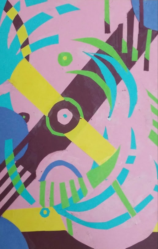
Working- I have created the major movement in the Deposition by using multiple different principles of design. I have created this movement through direction of lines, repetition of shapes (circles), lines, and colors. My focal point is in the correct spot. I have created textured patterns that help engage negative space. I have also engaged negative space through a weaving movement in my yellow lines, in which the background cuts through and gives a weaving movement of the background overlapping the foreground.
Not working- I still nee dot engage more negative space. I have no minor movements. I have too much visual complexity and variety. This is because my shapes and lines are too small and too different, I need more transitions.
Goals- I need to create larger and more solid shapes in the background that will add contrast and engage negative space, as well as take away some of the complexity and variety. I also need to repeat my visual movements so they do not just come to a sudden stop by repeating them and transition them in scale so that they gradually become smaller.
2/10
Working- I understand the movements in "Deposition" and can replicate them non-objectively. I understand in theory how to repeat shapes and add transitions based on value, size, and proximity.
Not working- I do not understand how to apply these concepts. I don't know how to balance the composition so it is not too busy but not too simple, or how to create effective transitions with non-objective shapes and lines.
Goals: Find a way to visually communicate the movement I want smoothly. Activate negative space effectively. Use value and shapes for better transitions.
2/13
Working- I am creating ore variety as I explore other methods of creating visual movement and excitement.
Not working- my design is not visually interesting; I'm not engaging negative space still and my shapes used to movement are too small. They are not creating enough transition or visual interest to encourage visual movement.
Goals- Engage negative space in a way that also adds to visual movement. Find a way to unify while also creating variety- repetition of some element. Add more contrast in colors and through placement of shapes.
2/15
Working- I have good transitions because of repetition of shapes. I have more visual excitement an variety with contrast in shapes and color. I am beginning to engage the negative space through a weaving movement in the background becoming the foreground by moving through my shapes. I would like to repeat this in other parts of my composition. I have also engaged negative space through implied shapes and lines between my other shapes and lines, which I would also like to repeat. I have the major movement down as well.
Not working- I have too much variety and contrast, there is too much visual complexity in my small and complicated shapes. I need more repetition of larger, solid shapes. This will also help me engage negative space more.
2/17
Working- I have created the major movement in the Deposition by using multiple different principles of design. I have created this movement through direction of lines, repetition of shapes (circles), lines, and colors. My focal point is in the correct spot. I have created textured patterns that help engage negative space. I have also engaged negative space through a weaving movement in my yellow lines, in which the background cuts through and gives a weaving movement of the background overlapping the foreground.
Not working- I still nee dot engage more negative space. I have no minor movements. I have too much visual complexity and variety. This is because my shapes and lines are too small and too different, I need more transitions.
Goals- I need to create larger and more solid shapes in the background that will add contrast and engage negative space, as well as take away some of the complexity and variety. I also need to repeat my visual movements so they do not just come to a sudden stop by repeating them and transition them in scale so that they gradually become smaller.
Critiques
2/13 Monochromatic Critique-
Make it engage negative space and makes it visually exciting by adding more variety and less unity in scale.
Transition between yellow and green for movement; both hues have the same intensity and value.
Use multiple different elements of design to create movement, add more value, determine my high and low contrast
Push the spiral at the focal point and repeat it in different areas of the composition.
Also push transparent effect created by changing of colors in intersecting lines.
2/17 Monochromatic Critique-
Create more negative space, more minor movement through repetition, repeat yellow weaving movement to help engage more negative space and create effect of background becoming foreground and back again.
Too much variety and visual complexity. Keep repeating movements and instead of having them stop, decrease them in scale to create better transition.
Increase the major movement once you have introduced the minor movements to create balance.
Post-Critique Writing
1. a. When initially designing the monochromatic, I did not have much of an understanding as to how I should go about the design in order to achieve the objective. As a result, my initial designs which were meant to help me understand where and how I want to use value were not very effective. As I moved on to the actual construction paper, the material used in this challenge, I found that I was not able to narrow any one strategy in my design. However, through feedback and criticism I was able to better understand certain methods that would help me to create visual movement, the challenge objective, using the material. I also began to understand what I was doing right or wrong based on my reflective writing and could then readjust and find out what methods I could use instead. This helped substantially when I redesigned and used more colors for my final design. I understood how to use shape and line to engage the negative space and proximity, color, value, and scale to create transitions and movement around the composition. I came up with a better design and began to tweak it further until I came up with the major and two other minor movements in the deposition by using some of my techniques in my monochromatic and applying them in a more efficient way. I used more repetition and layering to engage the negative space as well as using proximity, color, and shape to guide the eye in a certain direction to keep the visual movement.
b. My monochromatic had a strong major movement that was lost or at least weakened in my final design because I made the minor movement too strong. I also used tear-drop shapes in my monochromatic, which were good transitions between the sharp fan lines I used and the circles, but I did not include them in my final design. My final design had more minor movements and more fluid transitions in general than in my monochromatic design. It also had a playfulness to it, which I accomplished through layering, color and shape.
c. I did not have very successful transitions in my monochromatic design because I did not repeat many elements, they just stopped completely. My monochromatic design had too many elements that were not connected through repetition and did not help with visual movement. In my final design, the focal point became too strong and took away from the visual movement. The "X" shape created by the two rectangles became too dominant because of the scale of the shape, which was much larger in relationship to every other shape in the composition.
d. I used transition and color, proximity, and shape in order to create the major visual movement in my composition. Because of the directions of the lines and the shapes in negative space, I was able to create a counter-clockwise movement similar to the one in the Deposition. I used the same technique going clockwise. which is one of the minor movements in both my design and the Depositions. I also have a sandwich effect down towards the bottom of my final design which is meant to represent the platform in the Deposition. I also have the X movement created by my intersecting rectangles.
e. The fan shape is what provides the visual movement in my design. This is because my fan lifts the eye up and into the major counter-clockwise movement, while at the same time using negative space to encourage the eye to move clockwise in the minor movement. My fan shapes are repeated throughout the composition, helping to add to visual movement.
